Logos
Acorns 2 Oaks
This logo was designed to highlight the principal of the company name it's ethos. I used natural colours of brown and green to represent the colours of an oak tree.

Tdort Events
Using negative space to create top sections of the lettering gives it a clean shine effect to the design.

Ray Care Logo
The illustration of the logo is the R and the C of Ray Care coming together to form an elegant R.

Culbert & Sons
I created the logo showing the entire tree from root to the leaves and made sure it would work in one colour as they wanted to get vinyl t-shirts printed up using this logo.
Eamon Corless Logo
The client wanted a simple Black and white elegant logo that would reflect his work as a bespoke furniture designer.

LT Fitness Logo
The client wanted LT had to form part of the logo. So I came up the little character that incorporates the L and the T to form it's arms and legs.

Posters

Branch Coach Screen
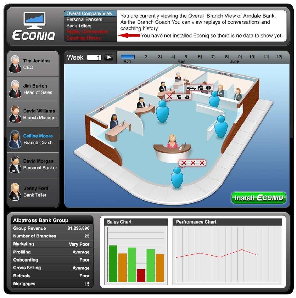
The bar at the top allows the user to select what time line they wish to view. Then the list below is populated with every personal banker in that branch.
Head of Sales Screen
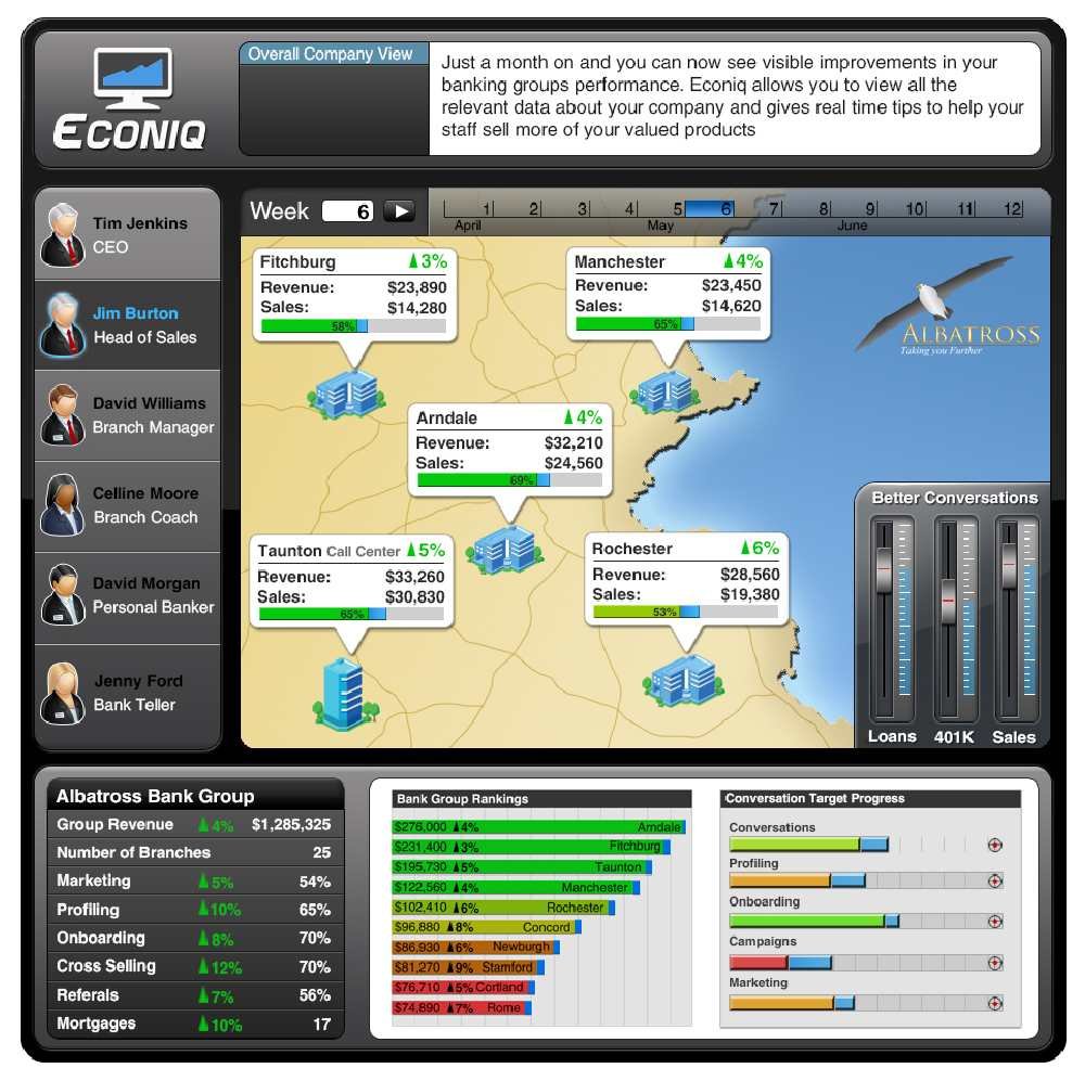
The map overview allows the user to view several branches, their vital sales stats and if they are achieving their goals. Below the map the ratings table allows the user to view the overall performance of each branch and the company as a whole.
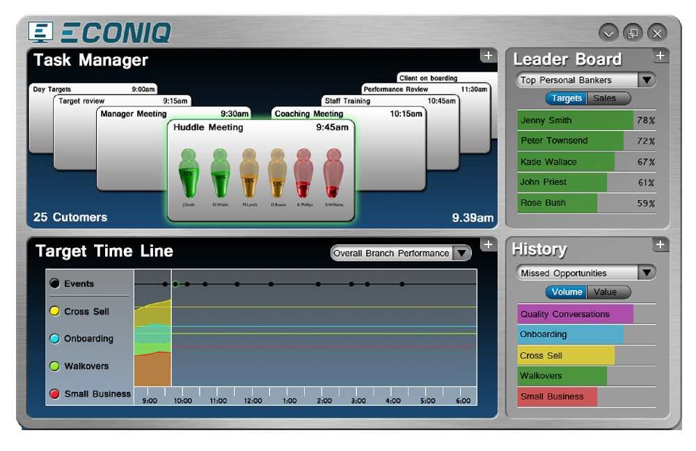
Task Manager
This task manager screen was designed for use by a branch coach to give an overview of a typical days duties.
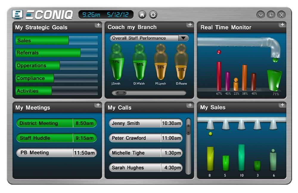
Task Manager Page 2
This screen allows the user to view and organise their day to day duties. The top section shows each task in chronological order.

I conducted a complete re design and build of the schools website. The previous website had not been updated very often and several of the page liinks consisted of PDF downloads. The client wanted the new website to be an acurate representation of the school and the activities it provides.
I am currently working with the school to finalise the content of each page so we can transfer the site to their URL. For now you can view the site I created here.

